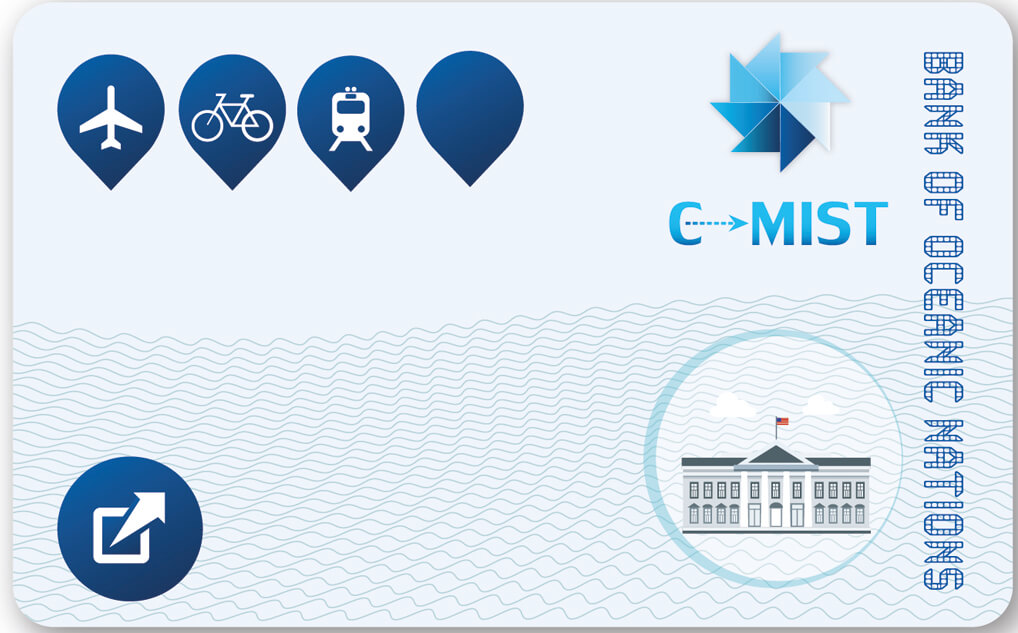
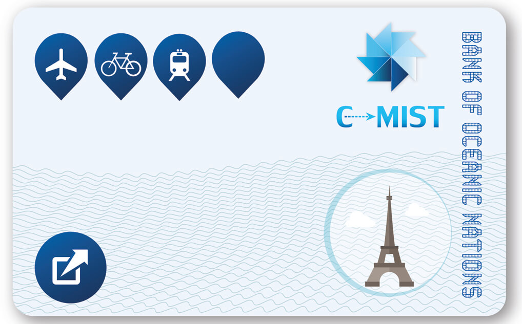
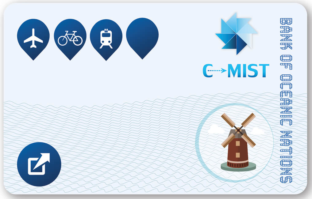
Joint Oceanic Nations

In this project, I am designing the currency of the Joint Oceanic Nations (JON), as well as banknote and c-mist travel cards. The central theme of the currency is the four seasons of the year which are not otherwise discernible underwater. Inspired by the Norwegian currency , the majority of the design elements are abstract and shape-based vectors. The designed artefacts include several adaptive user interface elements discussed below.

Unsplashed background img 1

bookmark

Logo

The main building block of the logo is a blue triangle, which reflects the feeling of progress and development in an underwater world. The complete logo is an abstract shape, that reminds a windmill vector. It comes as a result of multiplying the main triangle ten times, which represents the ten united nations. The windmill also represents the need for renewable energy sources in the underwater world.


bookmark

Currency

The currency is the common Dollar which is symbolised by a D with a strike through it. I have chosen a clean and simple font for the currency symbol, in order to make it easier to be hand-written. The top left line is slightly extended to the left, to give the feeling of stability and harmony. This has been inspired by a similar technique used in the symbol of the Euro currency.


bookmark

Season Symbols

Symbols will be used for the adaptive interfaces and represent the seasons of the year. I have used a raindrop for autumn, snowflake for winter, flower for spring and sun for summer.


The dome on the currencies is designed after the Berlin Cathedral Church

Unsplashed background img 2

bookmark

Banknotes

The front of the one-hundred-dollar banknote contains an abstract triangle shape comprising smaller triangles, the National Bank Director’s signature, the note’s ordinal number and the name of the Nation. There is also a relevant symbol (raindrop/snowflake/flower/sun) on the left-hand side of the note that reflects the current season of the year. Also, the theme colour changes based on the season.

For the back side of the banknote, I have designed a wavy vector abstract of curved lines, which reflects underwater life and water’s constant movement. A globe - for the 100 cred note, and a dome - for the 1000 cred note, emerges from these lines which represents living under/over the sea surface. The adaptive symbol is on the top left and the globe/dome are displayed on the bottom right as watermarks. The value of the note is displayed twice on each side.


bookmark

Banknote Card

I have used a triangle abstract shape for the front side. The value is displayed on a top layer, with a very low opacity and a metallic finishing. On the left-hand side of the triangle shape, the logo of JON and other essential elements like signatures and numbers are displayed. On the back side, I have chosen a more futuristic interface that has changed since the first assessment. I used a dark blue gradient for the background inspired by underwater life. Submarine instruments decorate this side and the adaptive symbol is located on the centre. Unlike with the smaller banknotes, the theme colour does not change with the season of the year.

To reduce the risk of theft and the impact of accidental loss, cards require fingerprint authorisation. On the bottom right and top left corners there are two fingerprint icons, with a loading bar below the latter. During a transaction, the owner of the card and the receiver must place their fingers on the two icons at the same time for a few seconds. Once the progress bar is full, it flashes green which indicates that the transaction is completed, and the card is now registered to the receiver.


bookmark

Coins

The front side comprises a wavy abstract with the value of the coin, the name of the union and the ten-triangle logo as background. The back side displays the year of the union’s establishment, a wavy abstract pattern representing the sea, and a vector shape of a half-sunk globe for the 10-cred coin logo and a vector shape of a dome for the 5-cred coin. The coins are made of glass and aluminium and will have a gold/silver colour theme during daytime that will turn into a dark fluo colour theme at night.


-->
Unsplashed background img 3

cast

C-mist card

Curved lines are also used on the C-Mist card. On both sides, the main concept is life below the surface and how people can take advantage of the high level of technology to communicate and survive underwater. This is reflected by the human-shaped vectors that seem to emerge from the sea on a globe background. In addition, there is a small bar that reflects the credit balance based on the average weekly spend.


Unsplashed background img 3

On the front side, both the logo and the name of the union are essential assets, as well as a button, which expands into a small screen that presents information relevant to the current trip (e.g. next stops, ETA). A nearby tourist attraction is also displayed on the bottom-right based on the location of the user. Click on the left/right arrows and toggle between the available attractions.


Do you want to live the four seasons Edinburgh experience?

Unsplashed background img 2

Propaganda poster

In this future world, people will be able to visit VR auditoriums offering virtual experiences. This poster will advertise a VR experience of the main attractions of Edinburgh in different seasons of the year. The poster shows a recognisable Edinburgh attraction in four different windows, one for each season.